Web Design
Improving a Local Auto Shop Website for Clarity and Conversion
Redesigned a marketing landing page for a local auto repair business to improve service clarity, strengthen trust, and guide users toward booking and contact actions.
Year :
2025
Industry :
Automotive
Client :
FRJ Auto Repair
Project Duration :
4 weeks
Overview
FRJ Auto Repair is a family-owned auto shop with two locations serving the Houston area. The goal was to modernize their digital presence and create a conversion-focused experience that clearly communicates services, builds trust, and drives appointment bookings.

Discovery & Research
With no access to internal analytics, I conducted a structured UX evaluation using industry-standard frameworks to simulate performance insights.
GA4 Framework: Identified potential drop-off points due to unclear value proposition and weak CTA hierarchy
Microsoft Clarity Approach: Anticipated low engagement on key actions due to visual competition and dense content
Screaming Frog Audit: Highlighted poor content structure, inconsistent hierarchy, and limited SEO optimization
This revealed a key issue: users could not quickly understand what the business offered or what action to take.
Challenges
Generic messaging failed to communicate expertise or specialization
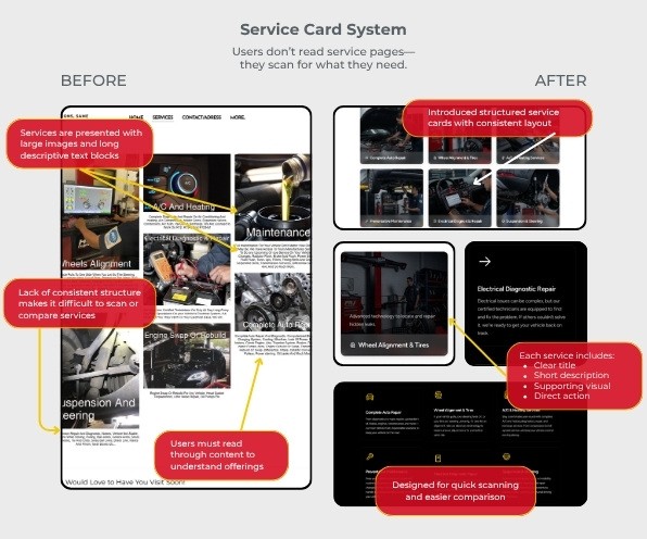
Dense content and inconsistent layout reduced scannability
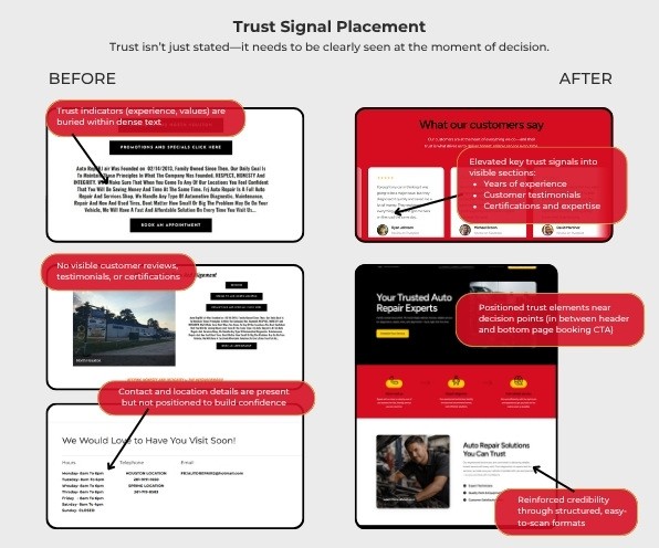
Trust signals were present but buried in paragraphs
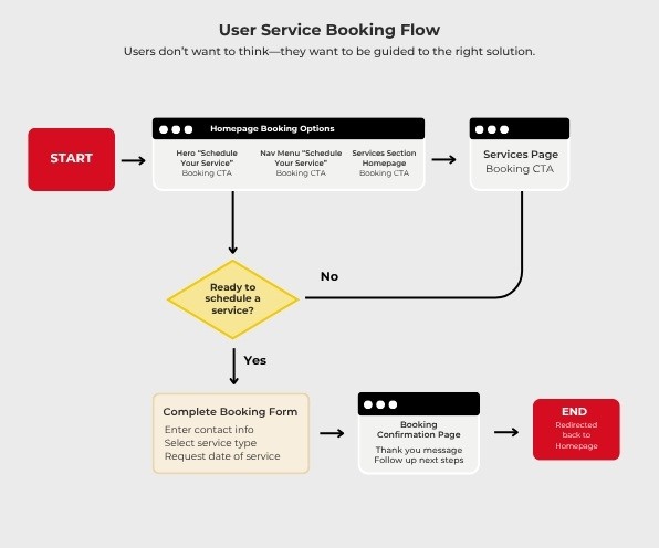
Multiple competing CTAs created unclear user direction
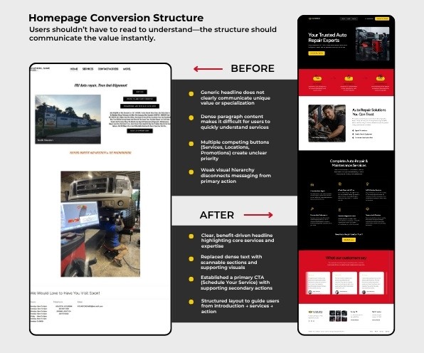
Design Solutions & Rationale
Introduced a clear, benefit-driven hero section with a primary “Book Appointment” CTA
Reorganized content into scannable sections with defined hierarchy
Elevated trust signals (experience, credibility) into visible areas
Designed a service-based structure to guide users from need → solution → action
These decisions focused on reducing friction and improving clarity at every step of the user journey.
Constraints & Considerations
No access to analytics or conversion data
No backend implementation or testing environment
Approach:
Applied heuristic evaluation and UX best practices
Simulated behavioral insights using analytics frameworks
Prioritized high-impact conversion improvements
Outcome
The redesigned experience transforms the site from an informational layout into a conversion-focused user journey, improving clarity, trust, and the likelihood of user action.
Closing
This project reflects my approach to identifying gaps in clarity and structure, then designing web experiences that guide users more effectively and support real-world business goals.
More Projects




Web Design
Improving a Local Auto Shop Website for Clarity and Conversion
Redesigned a marketing landing page for a local auto repair business to improve service clarity, strengthen trust, and guide users toward booking and contact actions.
Year :
2025
Industry :
Automotive
Client :
FRJ Auto Repair
Project Duration :
4 weeks
Overview
FRJ Auto Repair is a family-owned auto shop with two locations serving the Houston area. The goal was to modernize their digital presence and create a conversion-focused experience that clearly communicates services, builds trust, and drives appointment bookings.
Discovery & Research
With no access to internal analytics, I conducted a structured UX evaluation using industry-standard frameworks to simulate performance insights.
GA4 Framework: Identified potential drop-off points due to unclear value proposition and weak CTA hierarchy
Microsoft Clarity Approach: Anticipated low engagement on key actions due to visual competition and dense content
Screaming Frog Audit: Highlighted poor content structure, inconsistent hierarchy, and limited SEO optimization
This revealed a key issue: users could not quickly understand what the business offered or what action to take.
Challenges
Generic messaging failed to communicate expertise or specialization
Dense content and inconsistent layout reduced scannability
Trust signals were present but buried in paragraphs
Multiple competing CTAs created unclear user direction
Design Solutions & Rationale
Introduced a clear, benefit-driven hero section with a primary “Book Appointment” CTA
Reorganized content into scannable sections with defined hierarchy
Elevated trust signals (experience, credibility) into visible areas
Designed a service-based structure to guide users from need → solution → action
These decisions focused on reducing friction and improving clarity at every step of the user journey.
Constraints & Considerations
No access to analytics or conversion data
No backend implementation or testing environment
Approach:
Applied heuristic evaluation and UX best practices
Simulated behavioral insights using analytics frameworks
Prioritized high-impact conversion improvements
Outcome
The redesigned experience transforms the site from an informational layout into a conversion-focused user journey, improving clarity, trust, and the likelihood of user action.
Closing
This project reflects my approach to identifying gaps in clarity and structure, then designing web experiences that guide users more effectively and support real-world business goals.
More Projects
Web Design
Improving a Local Auto Shop Website for Clarity and Conversion
Redesigned a marketing landing page for a local auto repair business to improve service clarity, strengthen trust, and guide users toward booking and contact actions.
Year :
2025
Industry :
Automotive
Client :
FRJ Auto Repair
Project Duration :
4 weeks
Overview
FRJ Auto Repair is a family-owned auto shop with two locations serving the Houston area. The goal was to modernize their digital presence and create a conversion-focused experience that clearly communicates services, builds trust, and drives appointment bookings.
Discovery & Research
With no access to internal analytics, I conducted a structured UX evaluation using industry-standard frameworks to simulate performance insights.
GA4 Framework: Identified potential drop-off points due to unclear value proposition and weak CTA hierarchy
Microsoft Clarity Approach: Anticipated low engagement on key actions due to visual competition and dense content
Screaming Frog Audit: Highlighted poor content structure, inconsistent hierarchy, and limited SEO optimization
This revealed a key issue: users could not quickly understand what the business offered or what action to take.
Challenges
Generic messaging failed to communicate expertise or specialization
Dense content and inconsistent layout reduced scannability
Trust signals were present but buried in paragraphs
Multiple competing CTAs created unclear user direction
Design Solutions & Rationale
Introduced a clear, benefit-driven hero section with a primary “Book Appointment” CTA
Reorganized content into scannable sections with defined hierarchy
Elevated trust signals (experience, credibility) into visible areas
Designed a service-based structure to guide users from need → solution → action
These decisions focused on reducing friction and improving clarity at every step of the user journey.
Constraints & Considerations
No access to analytics or conversion data
No backend implementation or testing environment
Approach:
Applied heuristic evaluation and UX best practices
Simulated behavioral insights using analytics frameworks
Prioritized high-impact conversion improvements
Outcome
The redesigned experience transforms the site from an informational layout into a conversion-focused user journey, improving clarity, trust, and the likelihood of user action.
Closing
This project reflects my approach to identifying gaps in clarity and structure, then designing web experiences that guide users more effectively and support real-world business goals.